Ruder Finn
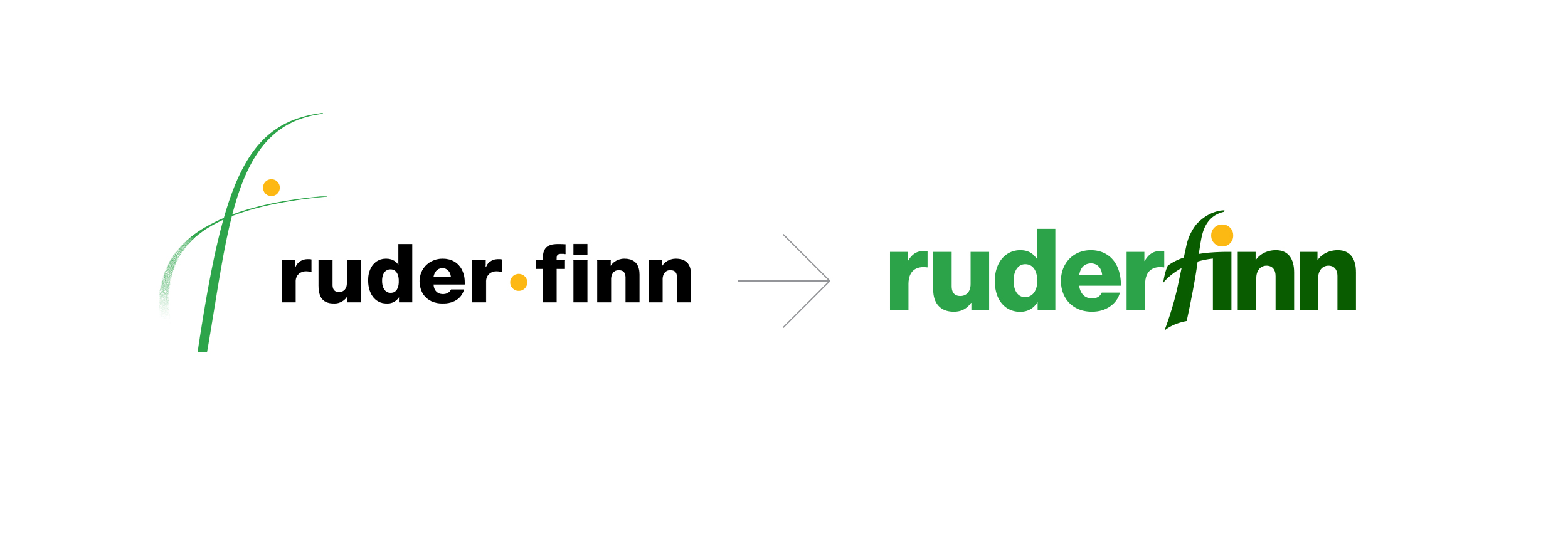
Ruder Finn is a full-service public relations agency established in 1948 in New York City and has grown to have over 15 offices globally. The company wanted a brand refresh that would bring it in line with its future goals while still retaining some of its heritage. An important part of that heritage was incorporating the original "F" symbol into the new logo, which was drawn by one of the co-founders on a bar napkin. The new wordmark brings together what used to feel like two completely separate elements. The organic flow of the "F" is also a reference to calligraphy which is a homage to Ruder Finn's large presence in Asia.


